Nando's PERi-PERi

File Under : Vegetarian Selling Chicken
Designing all of the things for Nando’s!
If you don’t know Nando’s, it's a PERi-PERi chicken company (PERi-PERi is a particular kind of pepper) that originated in South Africa and Mozambique, but now has restaurants all over the world, and has sort of a cult following to it. When I started working with them through an agency, I quickly realized what a dynamic company they were, outside of just selling chicken. They have been known to make a lot of radical statements, they do a lot of work to help underserved artists, and they do work in eradicating malaria in Africa—amongst a lot of other local charity work in the communities where they have their restaurants. Each location is completely unique, gets their furniture from South African makers, and they each have their own individual art collections. It’s a very unique experience.
Design-wise, the brand was a challenge for me to work with at first, because I wasn't used to using all of these layers and layers of textures, but it pushed me out of my box. I also didn't know much about African design or what New Africa was beforehand, but I knew I needed to learn that so that I could carry it through appropriately and respectfully. You must learn history—visual and otherwise—in order to be able to properly design for a company. That’s true about working with any brand.
One of my first and favorite projects with them was the opening of their first Chicago location. We sent “Under Construction” kits as the invite to the opening party (a small jab at themselves for how long it was taking to actually open the location). I flew to Chicago for the event itself and got to see my stage signage, and the booklets I designed talking about their art initiative.
In 2015, Nando’s HQ, located in in Johannesburg, decided it was time for a global rebrand. They brought me to South Africa and Mozambique to learn about the new look-and-feel. They also took me all around to soak up the culture, sights, history, and their origins, so that I could then come back to build everything out for the US.
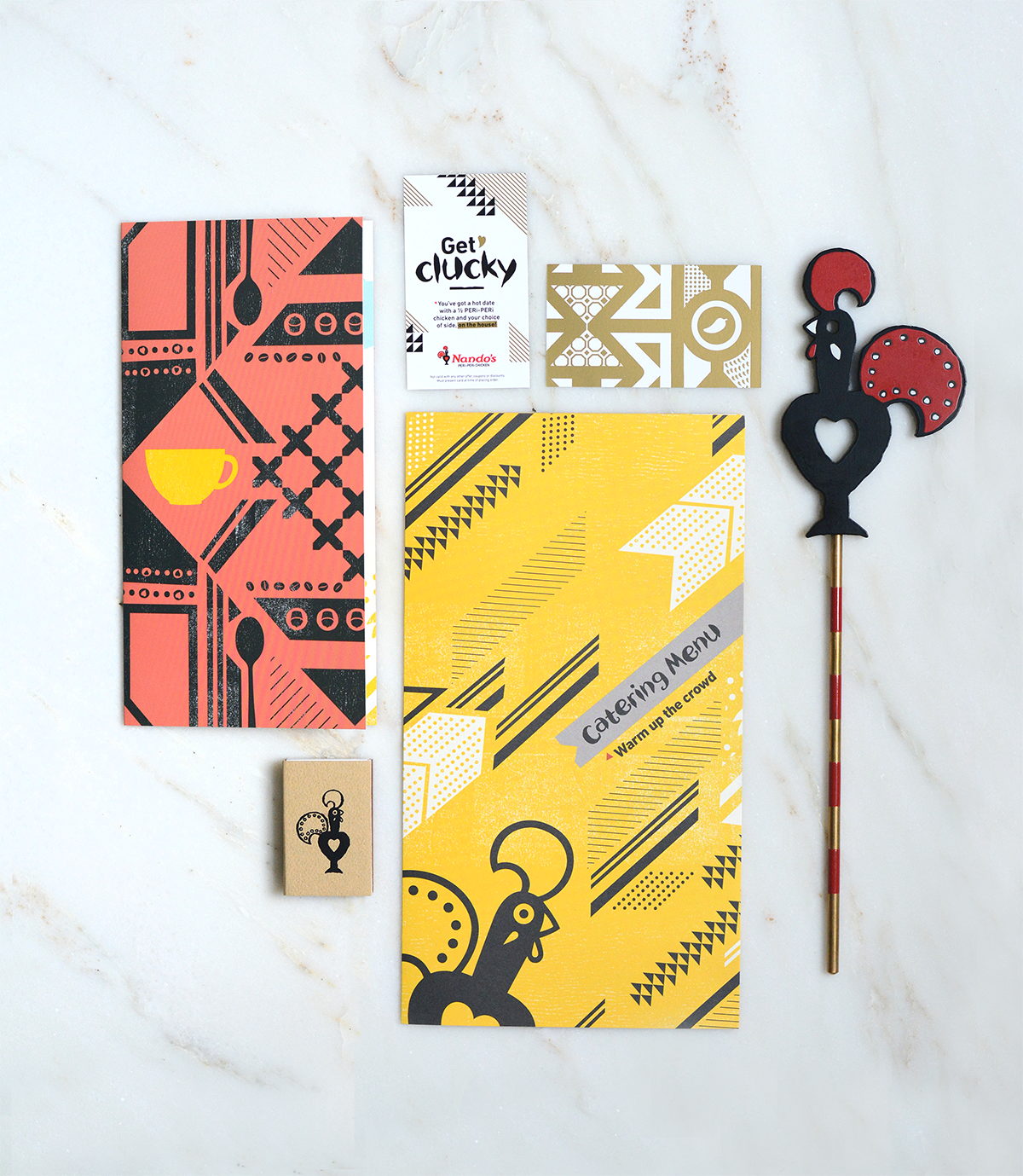
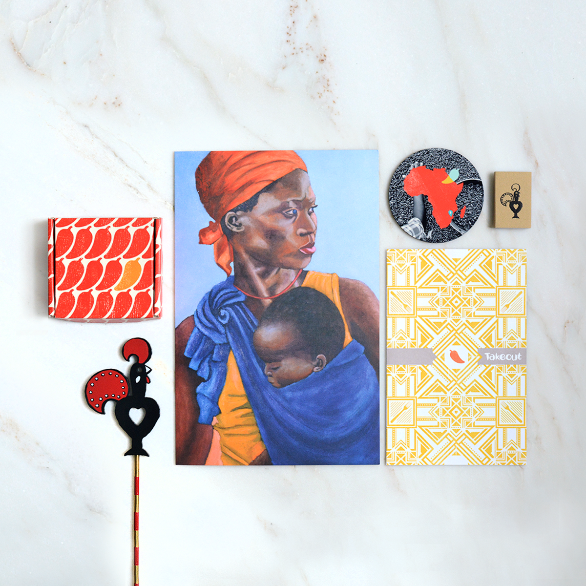
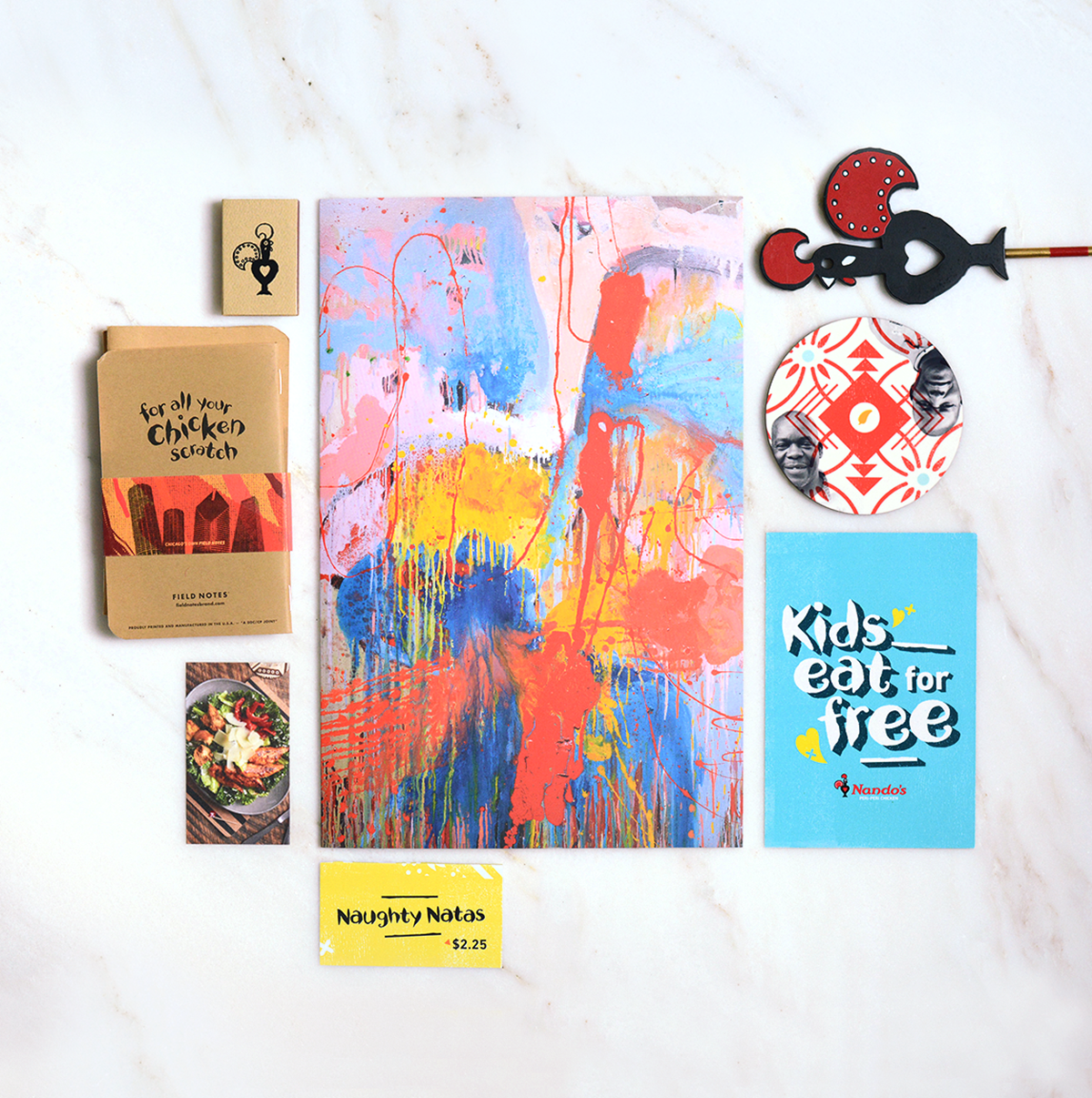
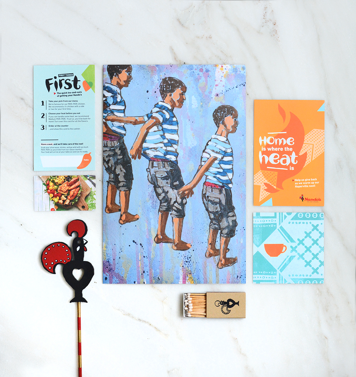
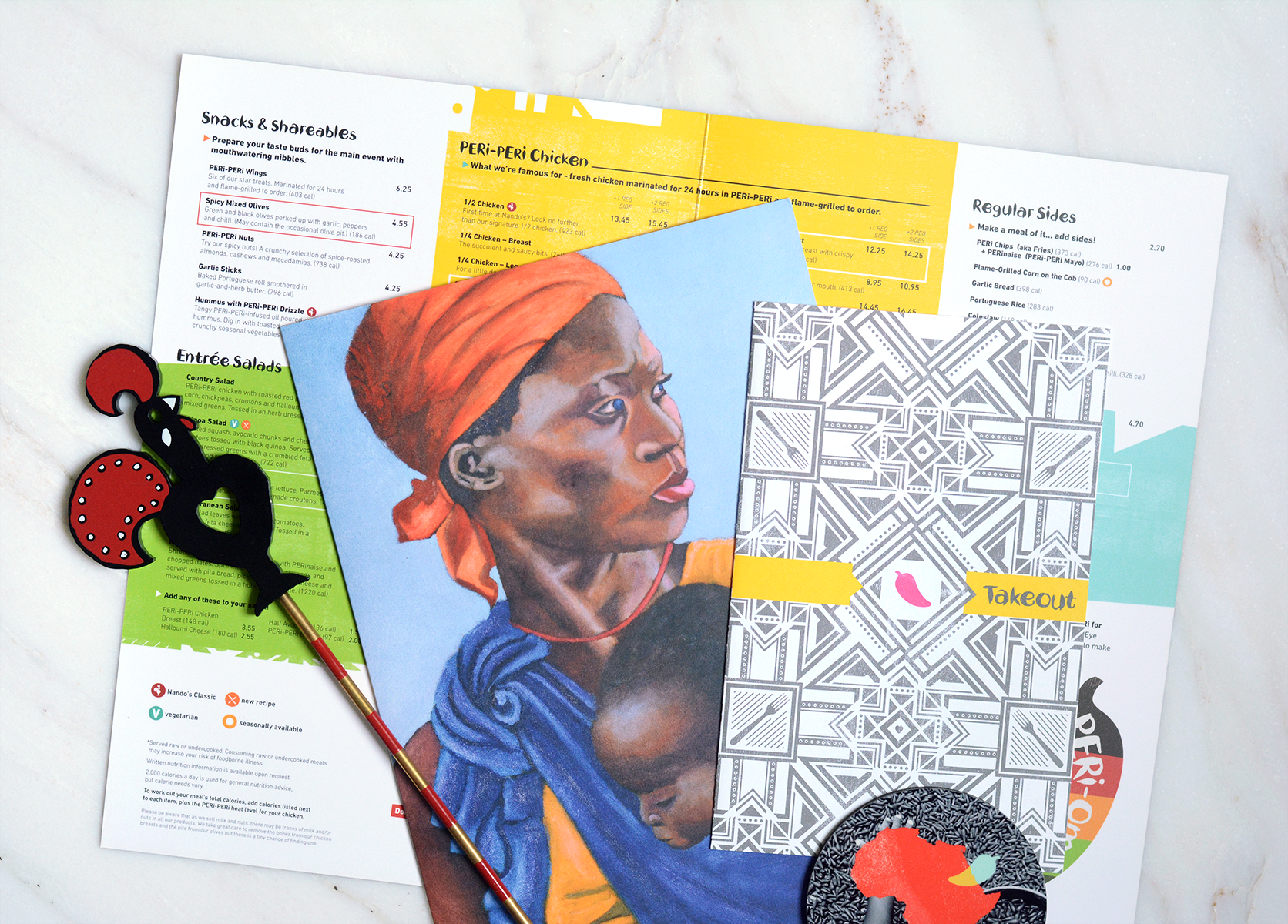
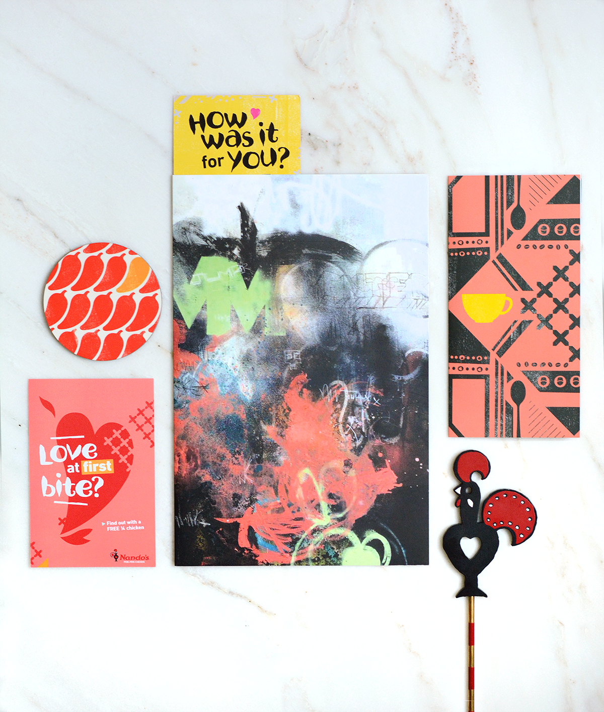
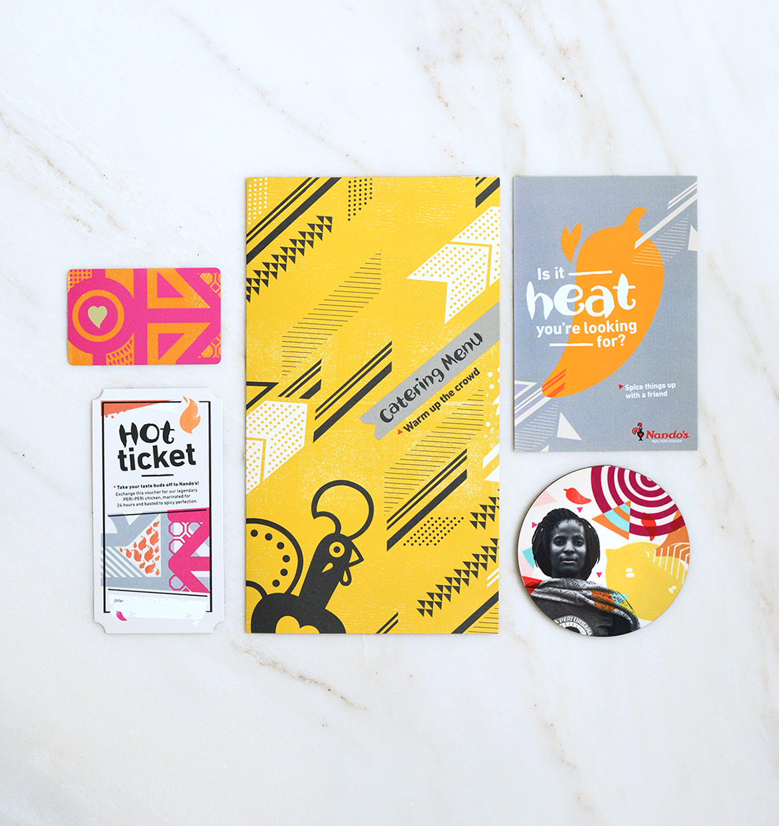
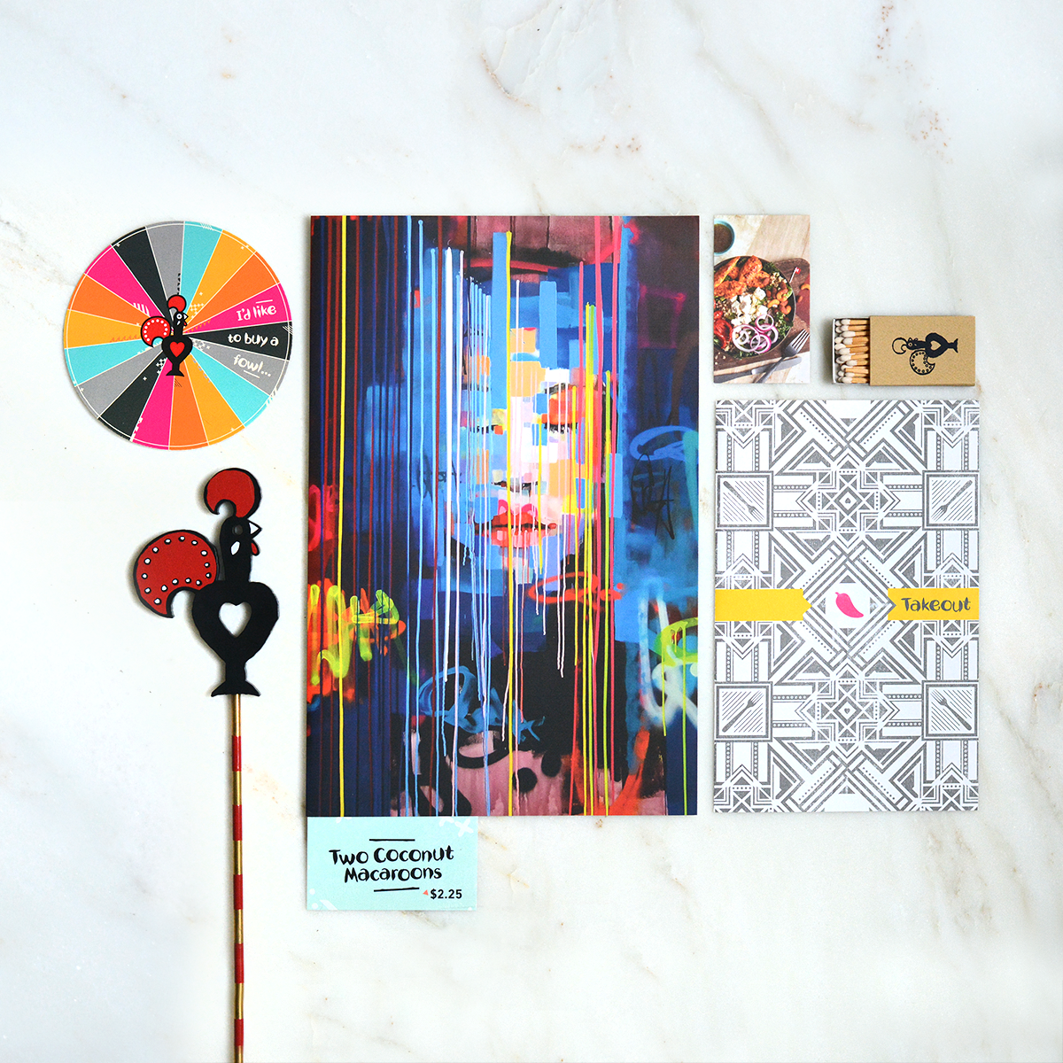
I returned to create in-restaurant as well as new restaurant opening materials with brightly-colored and patterned designs of African and Portuguese influence, to reflect the playful, creative collaborations of their food, and vibrancy of their customers. I used brand standards set by HQ, but was also allowed the freedom to develop designs based on that, and really made them our own.
These pieces range from menus, to vouchers, to collateral from various campaigns.
Every restaurant would have custom hoardings or window clings before opening: they always want to feel like they’re becoming part of the neighborhoods they’re in. The location on the left was by University of Maryland's campus, and so I used the Maryland flag for inspiration. (Y’all, in case you don’t know, Maryland LOVES their flag.) And when they opened a location across from the DC Zoo, I transformed a pattern to fit in with that.
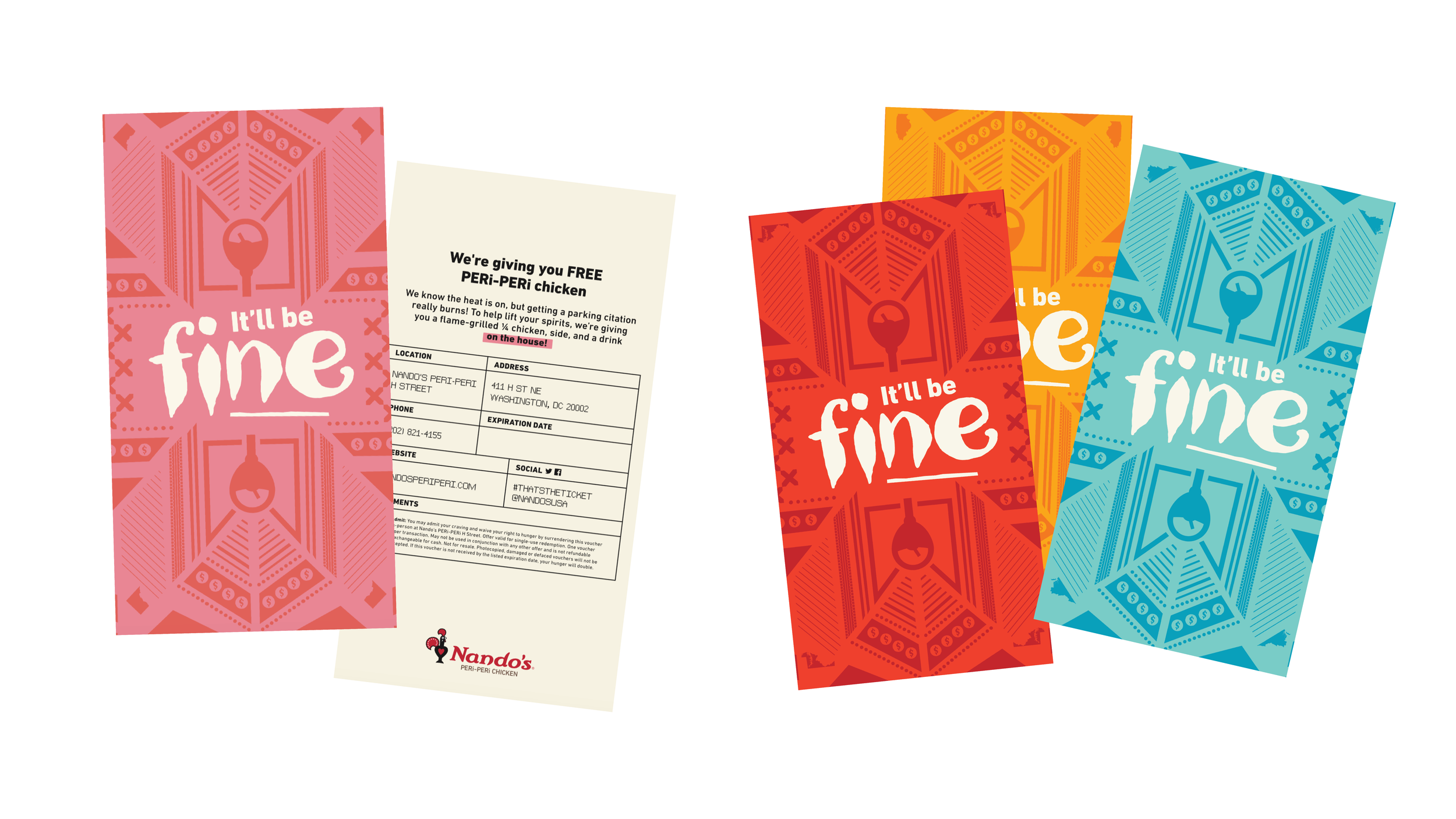
If you’re parked near a Nando’s and one of the employees sees you got a ticket on your windshield, they'll place this voucher on top ticket for a free meal, to sorta try to lessen the blow. I designed each to look a little like the parking tickets themselves (which differ per state—Nando’s in the US is currently in DC, Maryland, Virginia, and Illinois). The idea and design ended up being picked up in other countries where they have Nando’s! I also wrote all the copy for these.
I created a-boards galore, assets for social media…
…and art directed photo shoots.
Now that your mouth is undoubtedly watering from those photos, this is the end of my metaphorical trip into Nando’s Brand Land. And I’m leaving you with this:
One of my favorite parts of my time in Maputo with Nando’s were the markets and fabric shops full of beautiful shweshwe prints. As a special gift for the Nando’s US marketing team, I designed this peri peri chili pattern, figured out how to print on fabric with an Epson P9000, then sewed it up into tote bags. On a laser cutter, I made the little wood tags and coasters out of a gorgeous African wood, inlaid the coasters with an American wood—a nod to Nando’s roots, and their newer US home. There is absolute love and meaning behind each item.
Related work
