Håkan Chocolatier Rebrand

File Under : How Sweet It Is
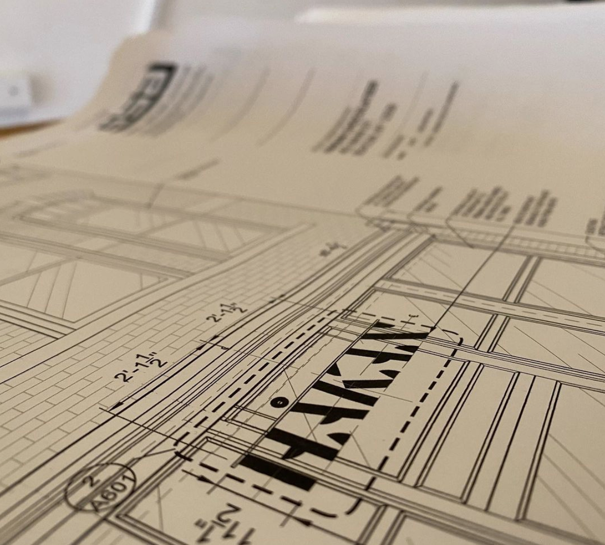
A New Logo for Håkan Chocolatier
(Note: This is just a quick sneak peek of the full rebrand, so please stay tuned for more!)
Håkan Mårtensson is an award-winning Swedish chocolatier who does everything from epic sculptures, to delicious bonbons and chocolate bars. After working on a few projects for him and his team (including a photoshoot), they came to me again with a need for a new logo.

In addition to doing research on Hakan and his company, and his competition, I also did research on Sweden’s design history, their type history, and their current design. While the history of their typography had no significant characters in play (PUN INTENDED), they currently have some wonderful type foundries, one of which I used for this project. (Check out: Letters from Sweden)

Motion concept and storyboard by yours truly, with motion by Ottoman Robot
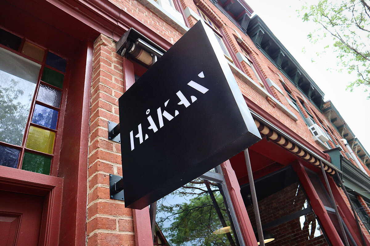
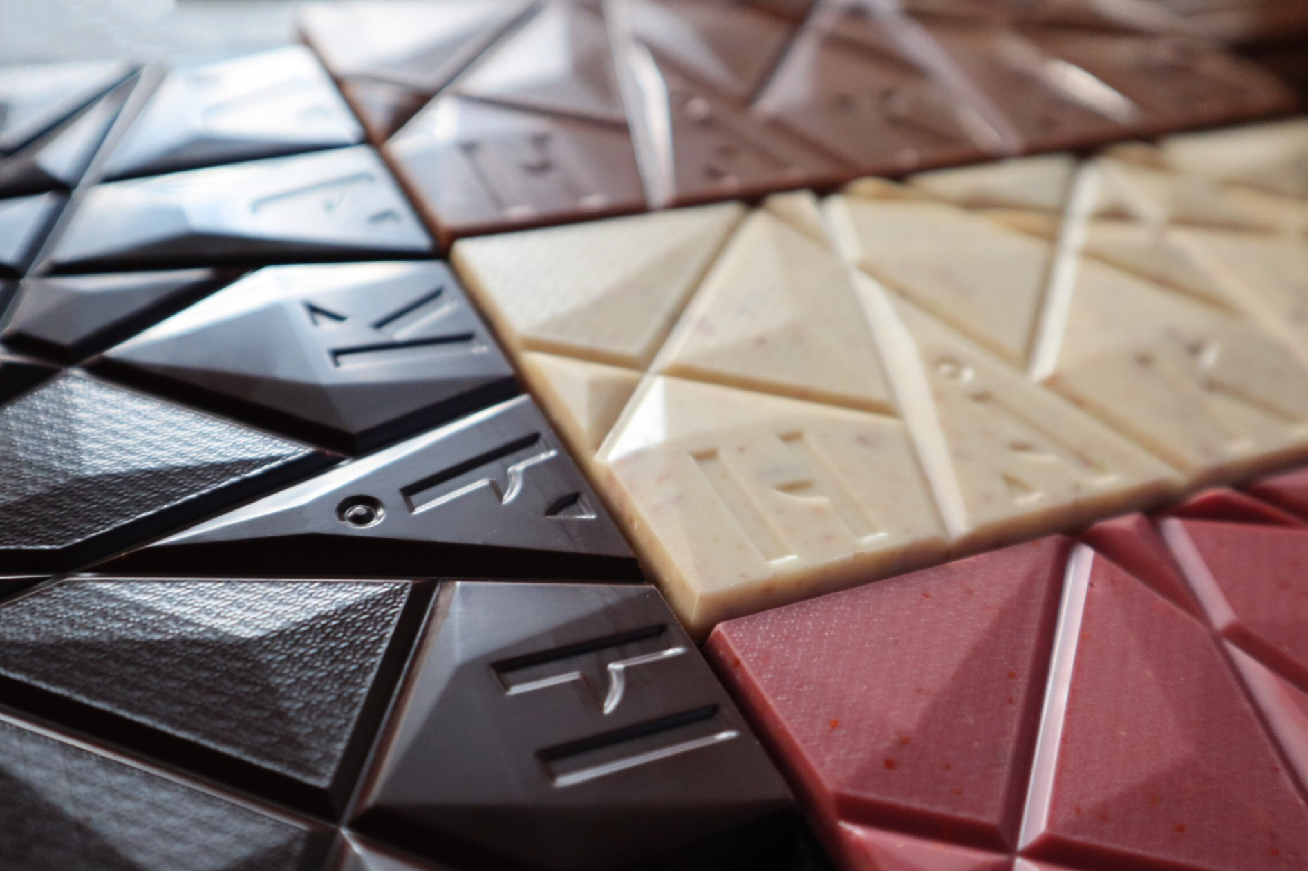
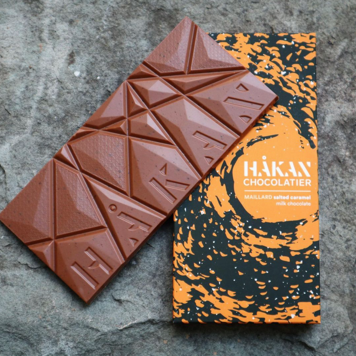
The letterforms have a structural feel, a nod to Håkan’s sculptures. The strokes on the A’s and N have forms that evoke bonbons. I wanted to make sure it still kept the Nordic touch as well, since that plays a big part of Håkan’s life and inspiration. The main type paired nicely with a simple sans-serif grotesque face for “Chocolatier”.
The H seamlessly separated out into a single, memorable icon:

Related work